Project overview
Puzzmatic is a domain-specific chatbot platform that offers digital companionship, provides expert business insights, delivers personalized psychological support, furnishes legal assistance, and more through chat and voice bots.
My role
I took charge as the Product Designer. Starting from scratch, I established the branding and developed the UI Kits, component library, guidelines, color palette, logo, and typography. I conducted research, ran experiments, and developed concepts while designing wireframes and prototyping.
Takeaways
- Working from scratch in a startup gives you the unbelievable superpower of being a versatile specialist! It's like being in a fast-paced business school where you're both the teacher and the student. There are opportunities to learn, unlearn, and re-learn at every nook and cranny.
- If additional funding had been available, I would have prioritized growing our design team and conducting further user interviews.
- I learned to see failure as an opportunity for growth and iteration and consider it a valuable career perspective.
- I would repeat it at least three times, but I learned by heart how to prioritize (in every area of my life)!
- Now I know how to wear the cap of the business owner and communicate with developers! Thanks,Tom Greever, for helping me hone my skills.
The problem
When I joined Puzzmatic, significant inconsistencies were undermining our UI design.
1. Our developer created a style guide, pieced together from random design systems and tailwind elements. There was a lack of cohesiveness for an understandable and user-friendly interface.
2. The mismatched design elements did not resonate with the psychology of the product. Our product's appearance seemed disjointed and occasionally unsophisticated, hampering user engagement.
3. There were many design styles - more than 15 colors and six fonts. This overabundance failed to achieve a uniform visual language.
4. The absence of documentation for using the style guide made it challenging to maintain continuity in design updates and work efficiently.
These issues undermined the user experience! It was clear that we needed to create a consistent design system.
Challenges
- Analyze and address inconsistencies in the user interface.
- Re-evaluate and align the design elements with the holistic product's psychology.
- Simplify the design styles by cutting down the amount of colors and fonts.
- Draft and produce clear documentation for the style guide to simplify usage and maintain continuity.
- Streamline the user experience to make it more intuitive and user-friendly.
- Boost workflow productivity by normalizing the design process.
- Build a consistent brand identity that resonates with the product's mission and vision (logo, font, colors, spacing, grid, layout).
Customer Discovery
One of the most common misconceptions of our team was the False consensus effect. That is where interviews and usability studies come in handy because every conversation must be rooted in data. Eventually, we organized a lot of internal rules and feedback, cross-referenced it with user feedback, and prioritized design changes.
Process
After gathering and analyzing all the data, I scheduled a meeting to present my findings and recommendations for creating our Design Library. What was decided to create:
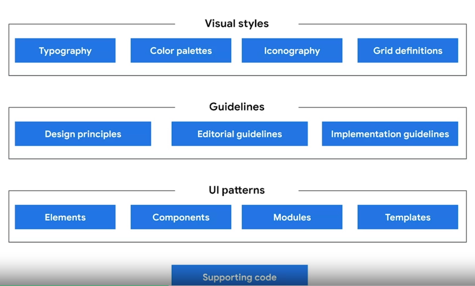
#1 Design Principles
We gathered all principles that feel right to our product and satisfy our users' needs. For brainstorming, we used FigJam. Here are I added our Design Systems principles since they overlap with product design principles:
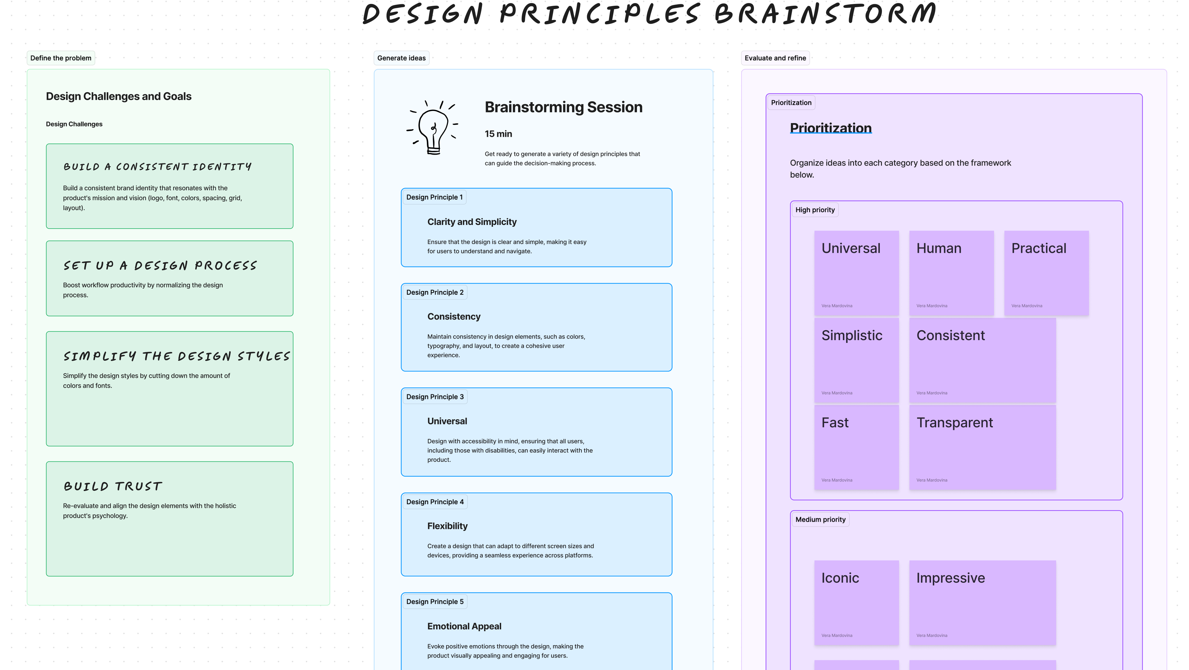
- Universal: Our design needs to work for everyone, every culture, every language, every device, every stage of life.
- Human: Comfort and trust are key attributes we wish to instill in our users.
- Simplistic: A minimal, well-lit space encourages participation and honest, transparent communication.
- Consistent: Following Jakob's law and maintaining consistency across the design can improve user learnability and comfort.
- Practical: Our product leans more toward utility rather than entertainment, designed for everyday usage while delivering valuable services efficiently.
- Fast: Speed is of the essence in our design. We promise a swift, responsive, and readily available user experience.
- Transparent: We value the ideas, thoughts, and conversations our users share, reciprocating their trust with our commitment to absolute honesty and transparency.
#2 Colors
Guided by the psychology of color, we chose the Analogy Triad Color palette (three-spaced colors on the color wheel). Analogous colors (those next to each other on the color wheel) create a calming effect, while triadic colors are more vibrant. Purple and blue generally evoke feelings of trust, sophistication, and tranquility.
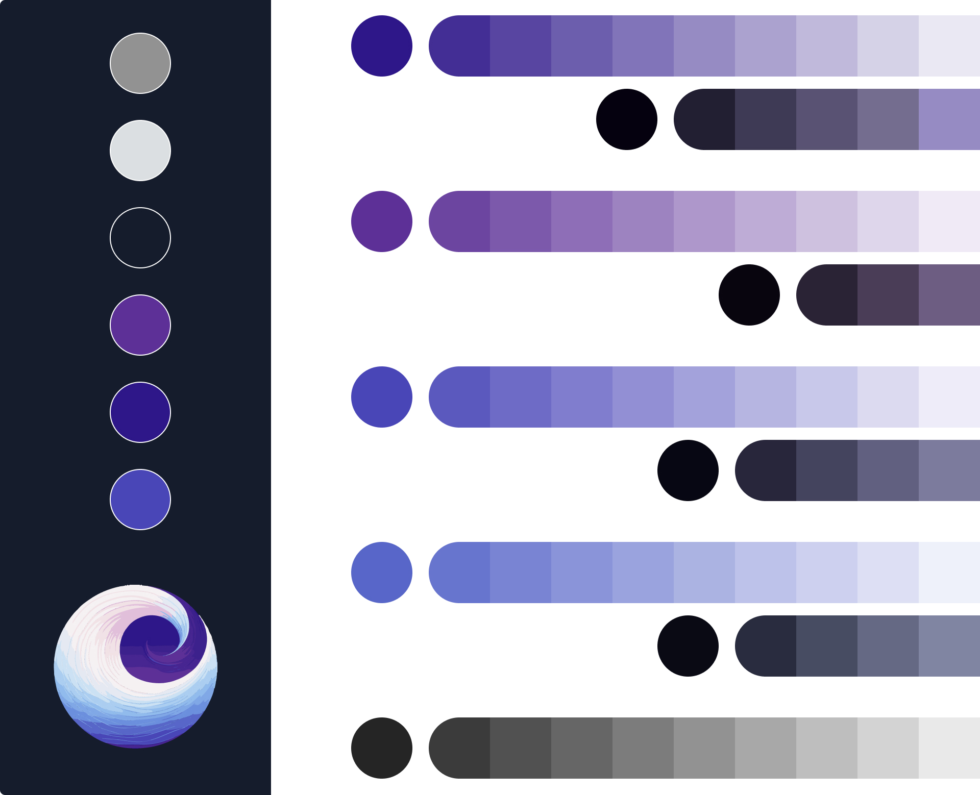
I organized a table with all the colors, including colors for error messages and disabled features, including the names of colors, their HEX codes, RGB, their specific usage in the design, and visual examples from the product to illustrate their application.
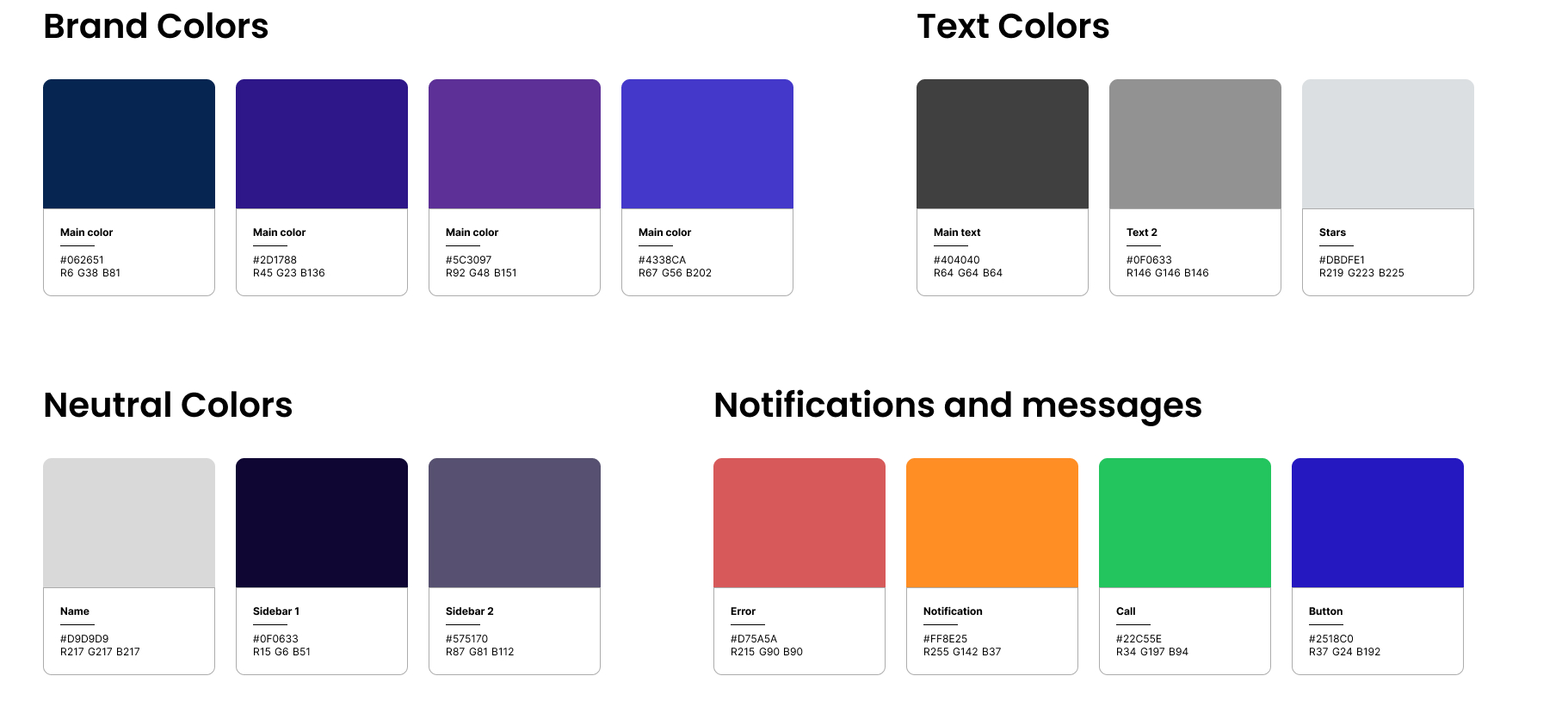
Eventually, we got a document with all colors for the guideline, the product, and additional products, as a pitch deck and mass media materials.
#2.1 Colors: Accessibility checking
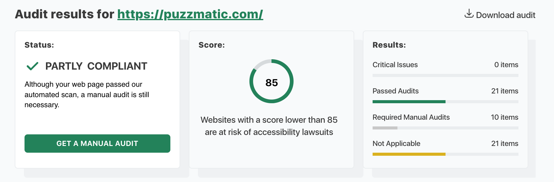
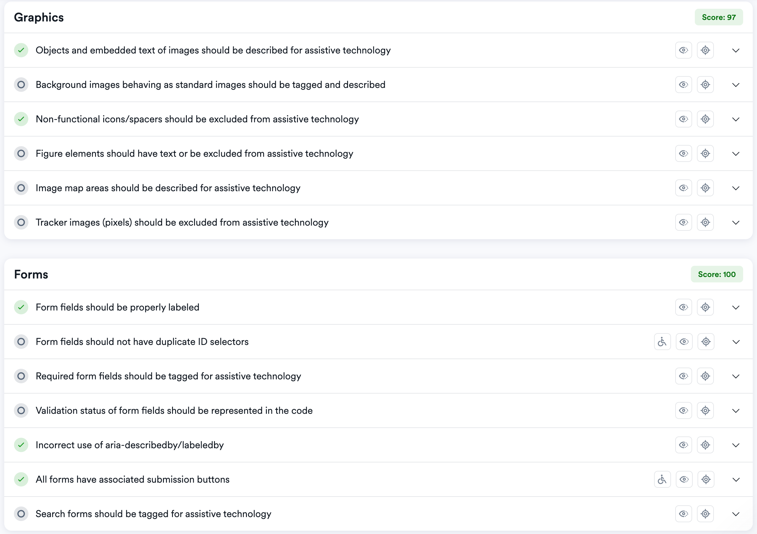
Throughout all stages of creating the design system, we went through accessibility checks, including text contrast tests at this stage. As a result of initial checks, we found problematic areas with unreadable colors, but later, we tweaked the colors to make our product inclusive.

#3 Typography
We settled on grotesque fonts for headlines and body text, as they are known for their legibility and contemporary appeal.
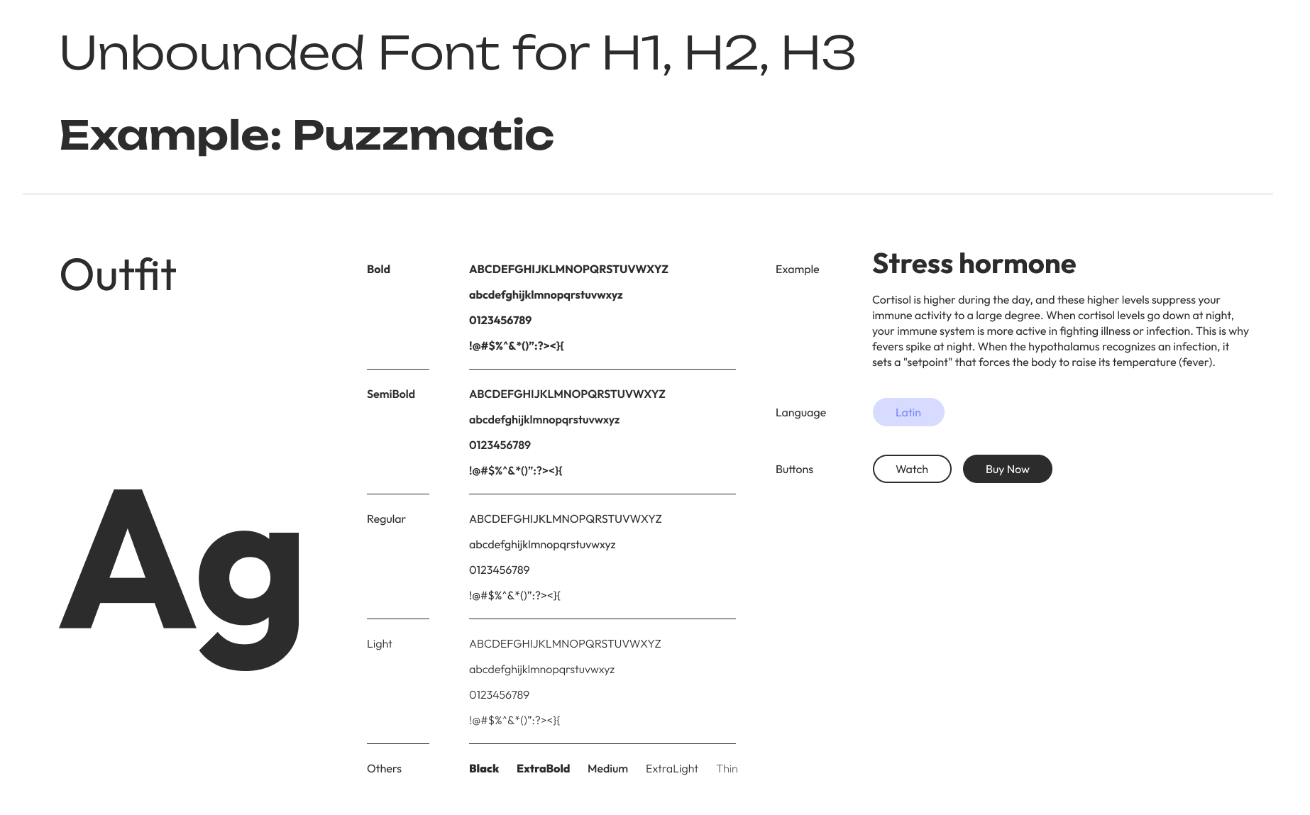
Both fonts met our design principles and main criteria:
- Fonts are easy to read and understand, especially at various sizes and weights. "Outfit" has clear letterforms and spacing for optimal legibility.
- The fonts align with the tone and personality of our brand. Since Puzzmatic focuses on digital companionship and expert insights, an approachable, trustworthy, and professional font is essential.
- The fonts complement the other design elements, such as our color palette and iconography, to maintain consistency across the platform.
An example of our typography documentation:
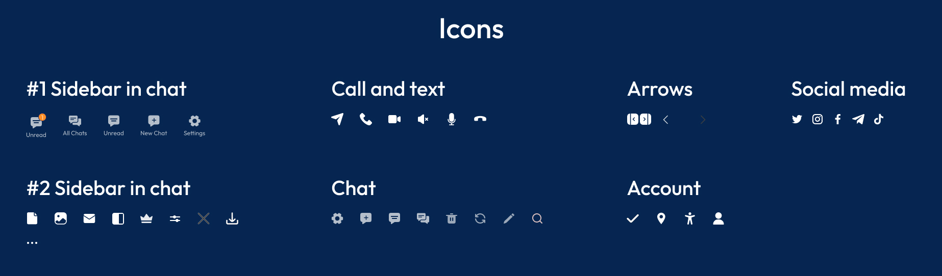
#4 Iconography, Images, component library
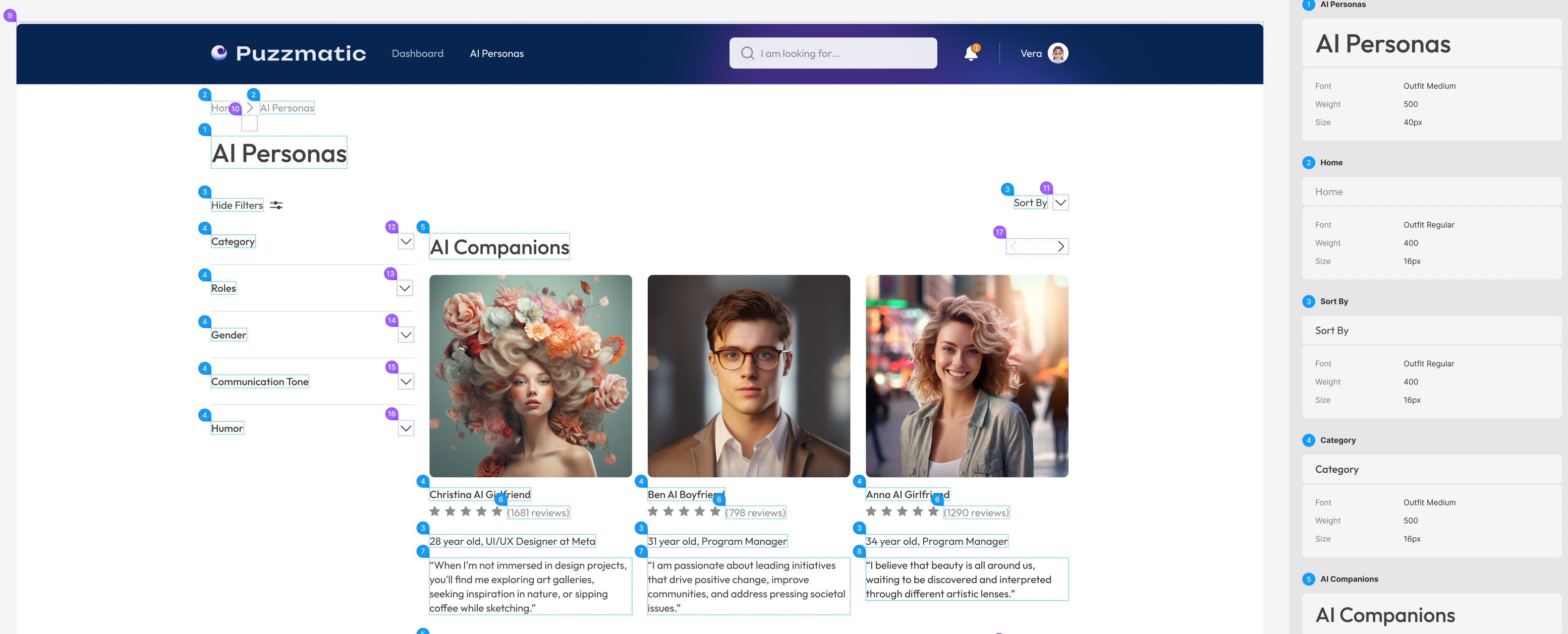
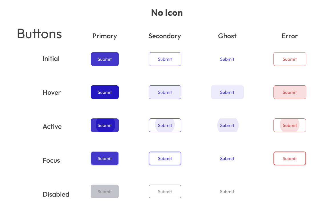
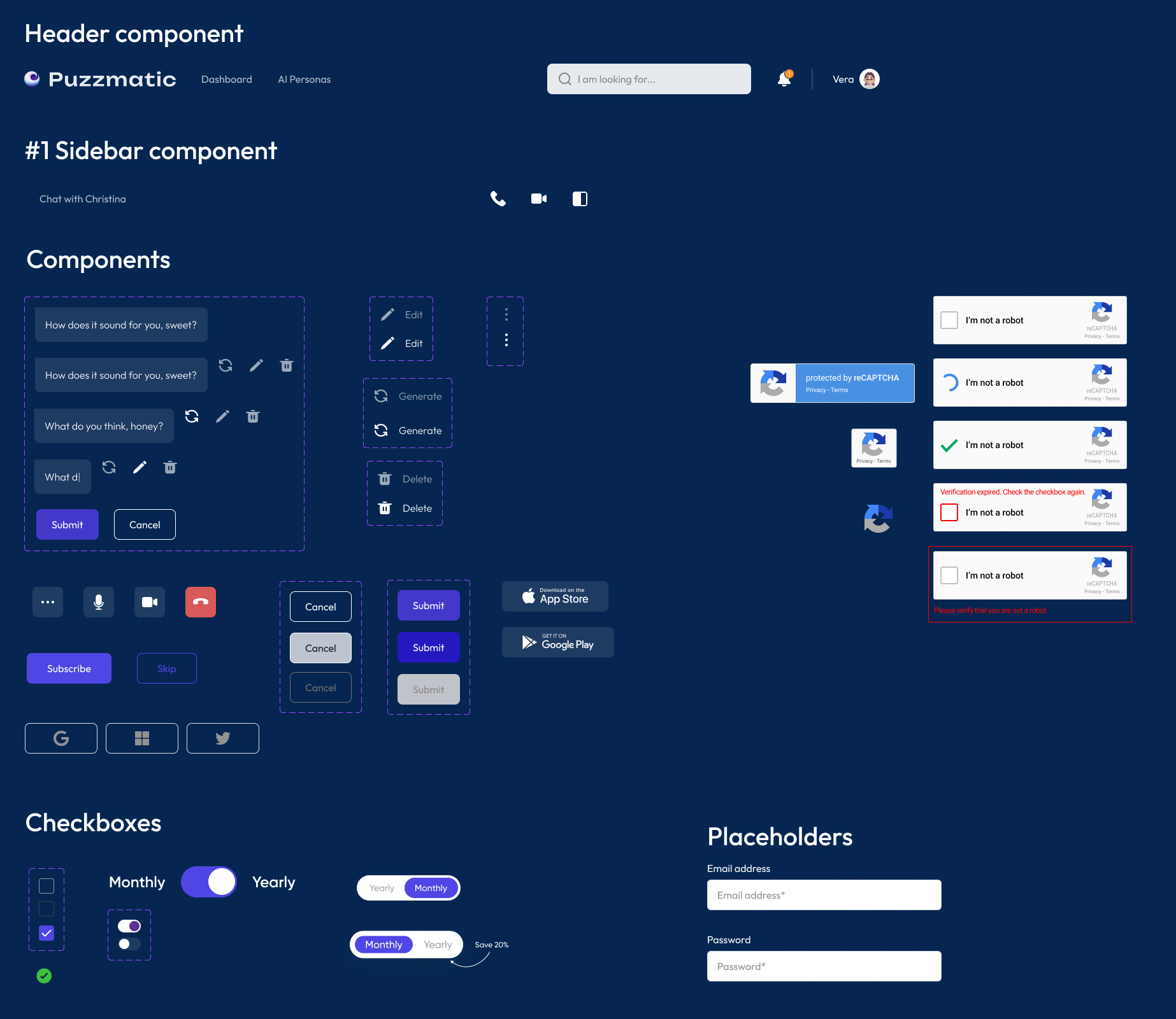
I've included some of the components in the screenshot from the system design documentation. We used Midjourney prompts adapted for our product to search and generate pictures.
Everything was checked for accessibility.
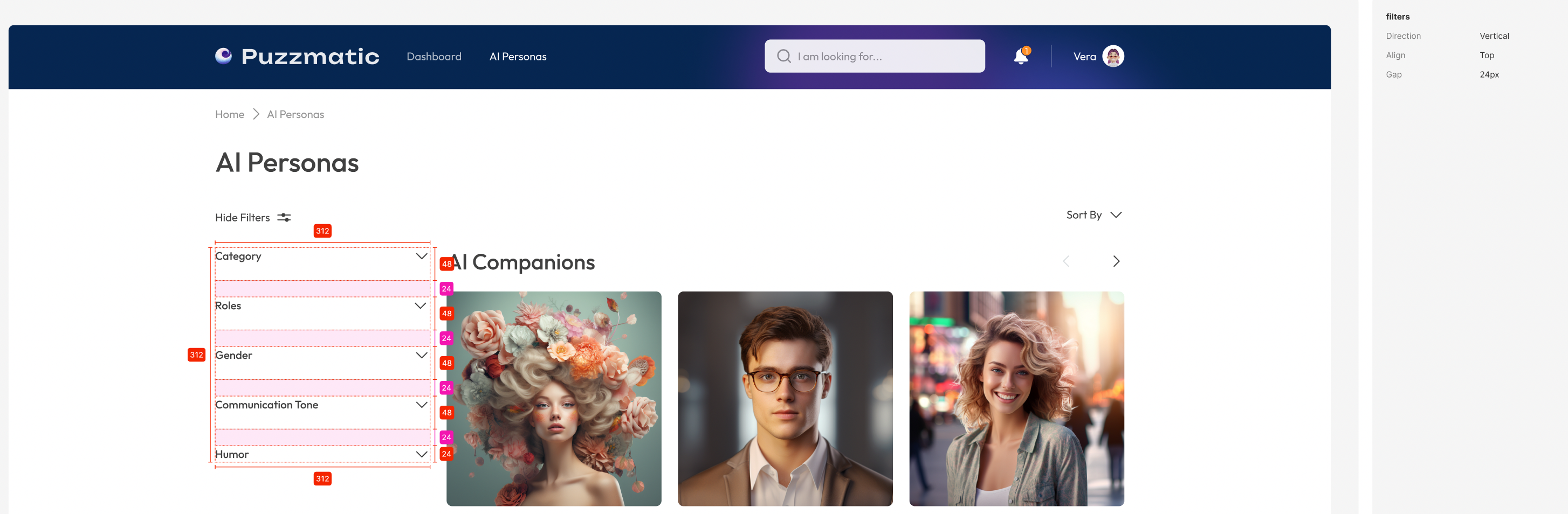
#5 Grid System, Sizing and Spacing
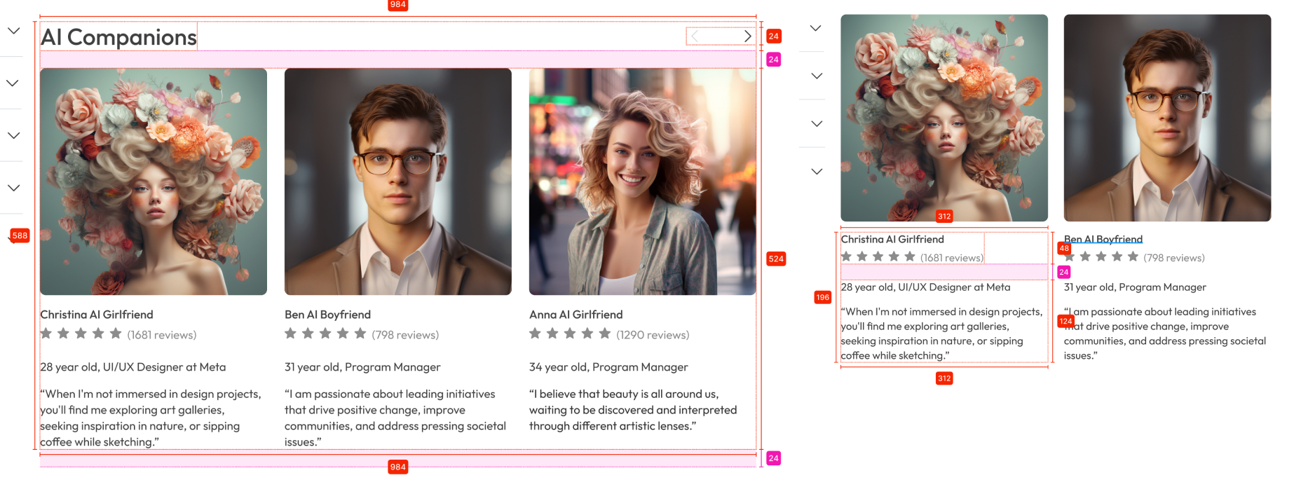
In my passion for creating a harmonious and cohesive visual experience, I used the 8pt grid system. The core principle to realize is that each element and space of the UI can be a multiple of 8.
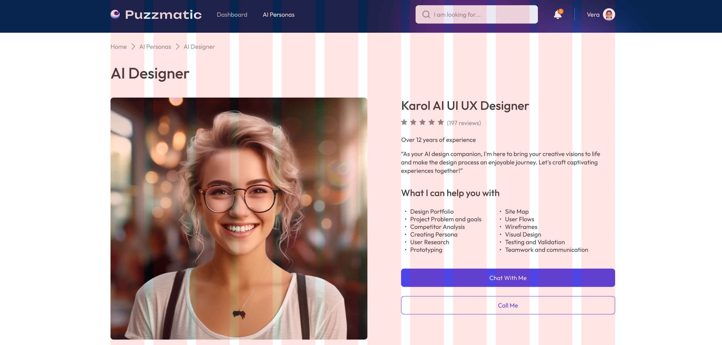
Examples of the Sizing and Spacing documentation:
Usability testing (Hi-fi mockups)
After creating the design system, I designed the mockups, applying all the rules from the documentation. Then, I organized a usability study focusing on checking colors, fonts, and spacing. In the picture below, I have shown the structure of the usability study.

There were 5 participants in the study, and the interview lasted 15-20 minutes. During the usability study, I used a note-taking method, which helped me organize and synthesize all the information on miro.com.
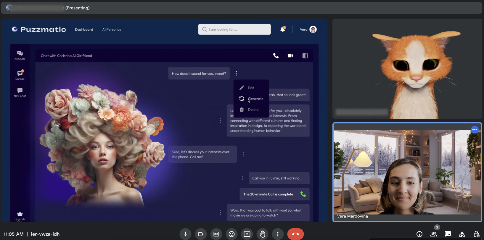
Usability findings and recommendations
After analyzing and identifying all the insights, I created a presentation for our team with findings and recommendations.
#1 Finding
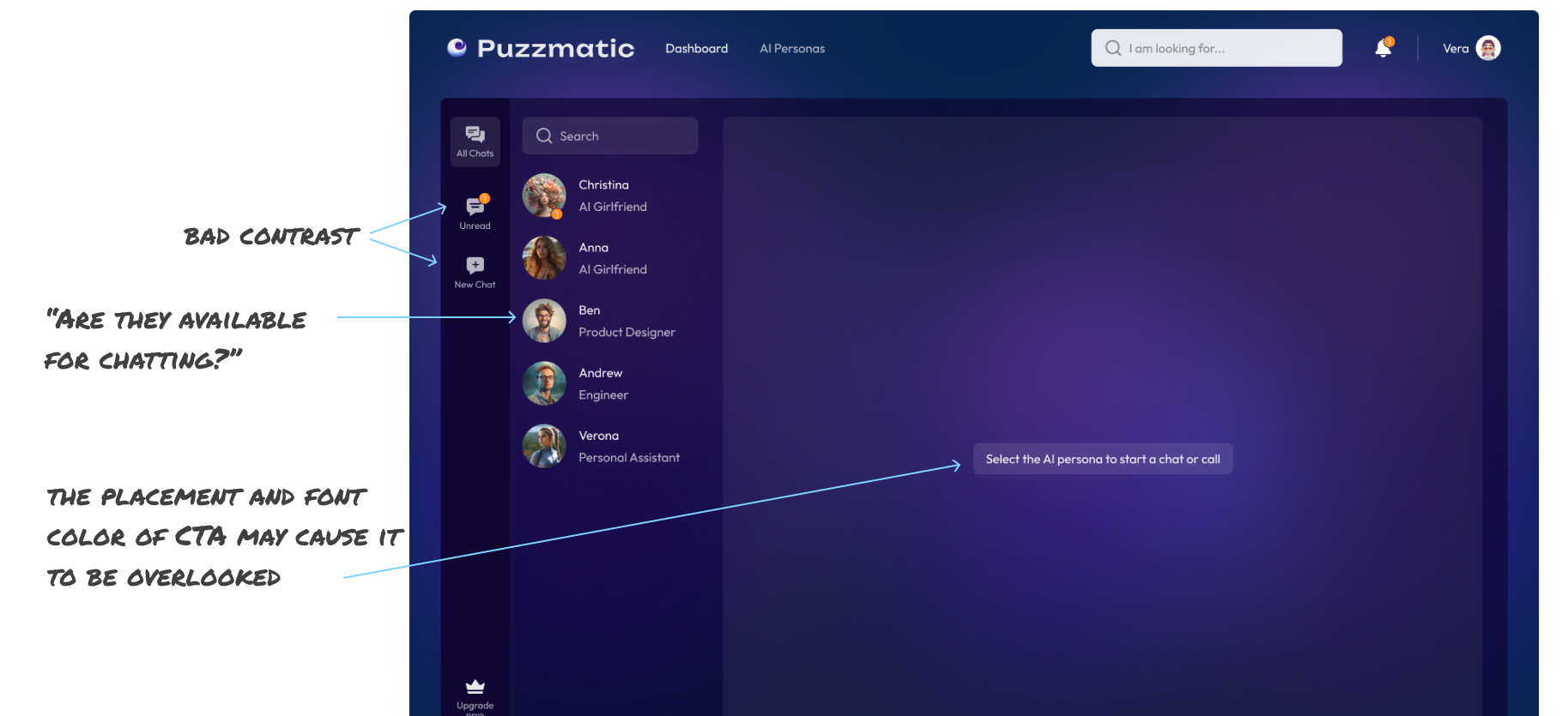
Recommendation
- For some users, particularly those with visual impairments, the contrast between the text and the background may not be sufficient, especially with the lighter purple shades. Increasing contrast could hinder readability and accessibility.
- Add animations or highlights when a user hovers over an AI persona to signify the ability to interact with them.
- Increasing the font size or changing the color of the CTA to stand out more against the background gradient could improve visibility.
#2 Finding
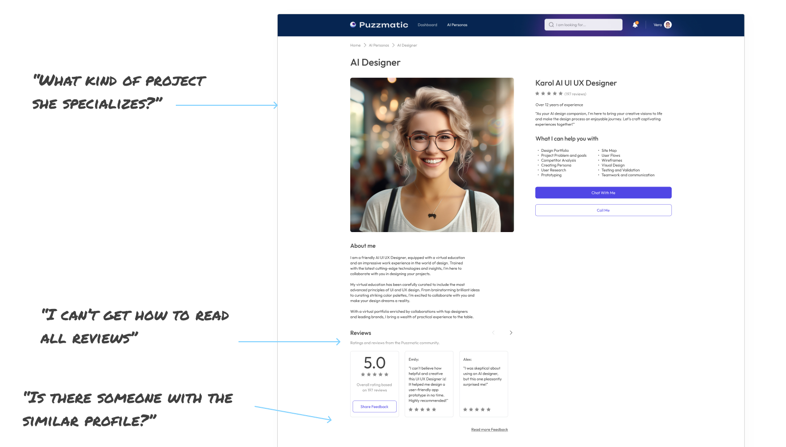
Recommendation
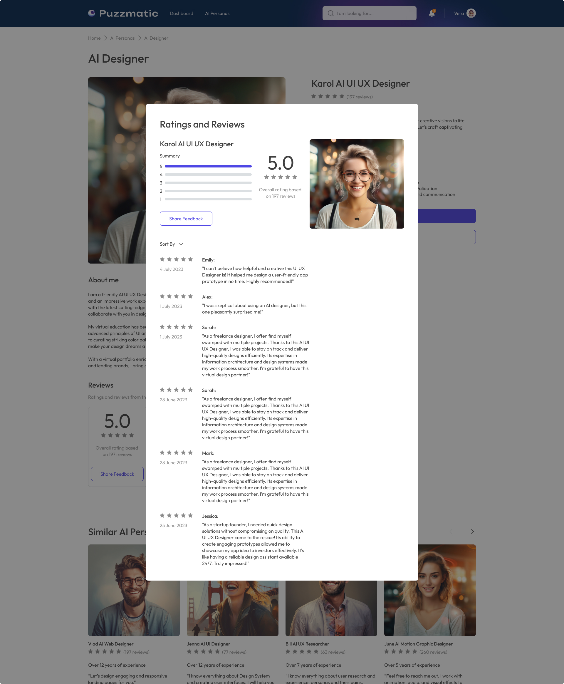
- Add a modal window for Reviews. This would help users understand there are more reviews to read without having to interact with the widget first.
- Including a section that more explicitly outlines the kinds of projects the AI Designer specializes in could help users identify if their needs match the AI designer's skills.
- Add similar AI Personas.
#3 Finding
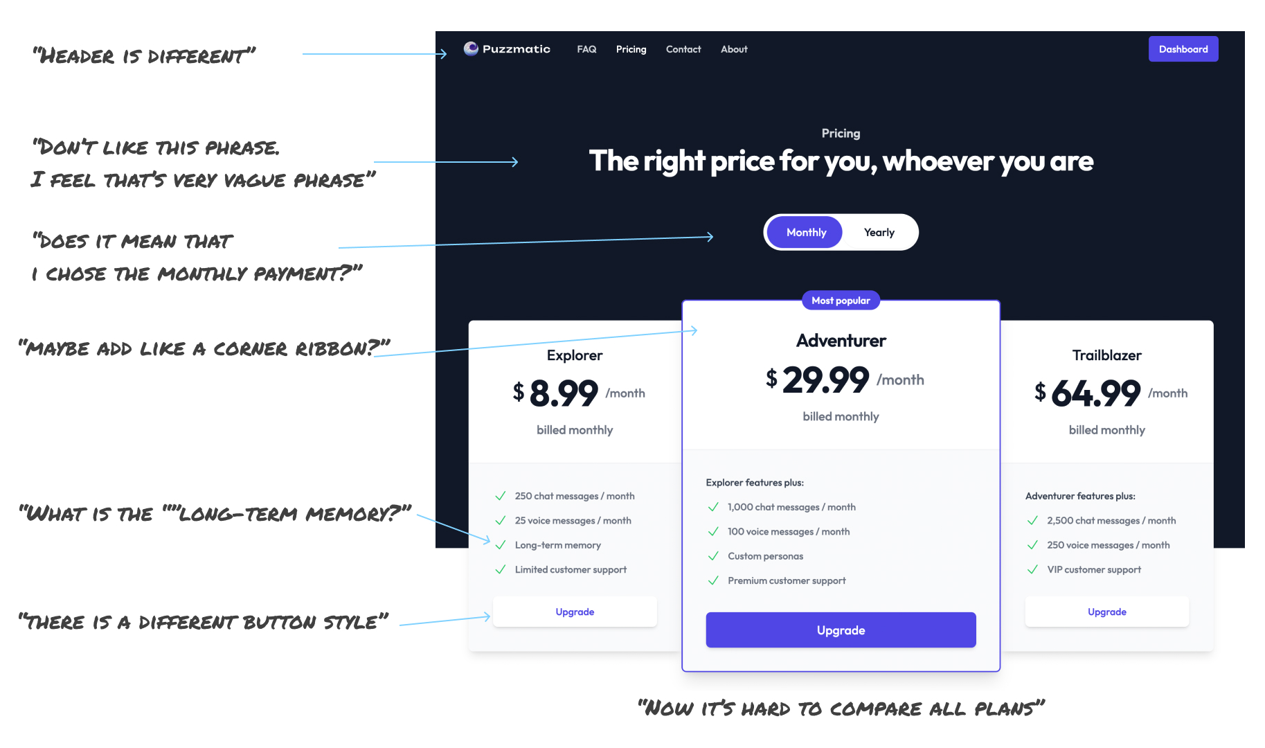
Recommendation
- Change the header to match the style of other pages.
- While the header "The right price for you, whoever you are" is inclusive, it may not clearly communicate the page's purpose. Consider using a more direct header like "Choose Your Plan" to set the immediate context.
- The 'Monthly' and 'Yearly' toggle could be styled to indicate more clearly which option is selected. A stronger contrast or a more pronounced switch might improve usability.
- The 'Most popular' tag on the 'Adventurer' plan seems floating. Integrating this label (like a corner ribbon) into the card design can make it look more cohesive.
- Change the button style according to our design system.
- Adding tooltips or a short sentence explaining what 'long-term memory' or 'custom personas' entail could assist users in making more informed decisions.
- Organize information more comparably. Clarifying all differences can play a key role in decision-making.
#4 Finding
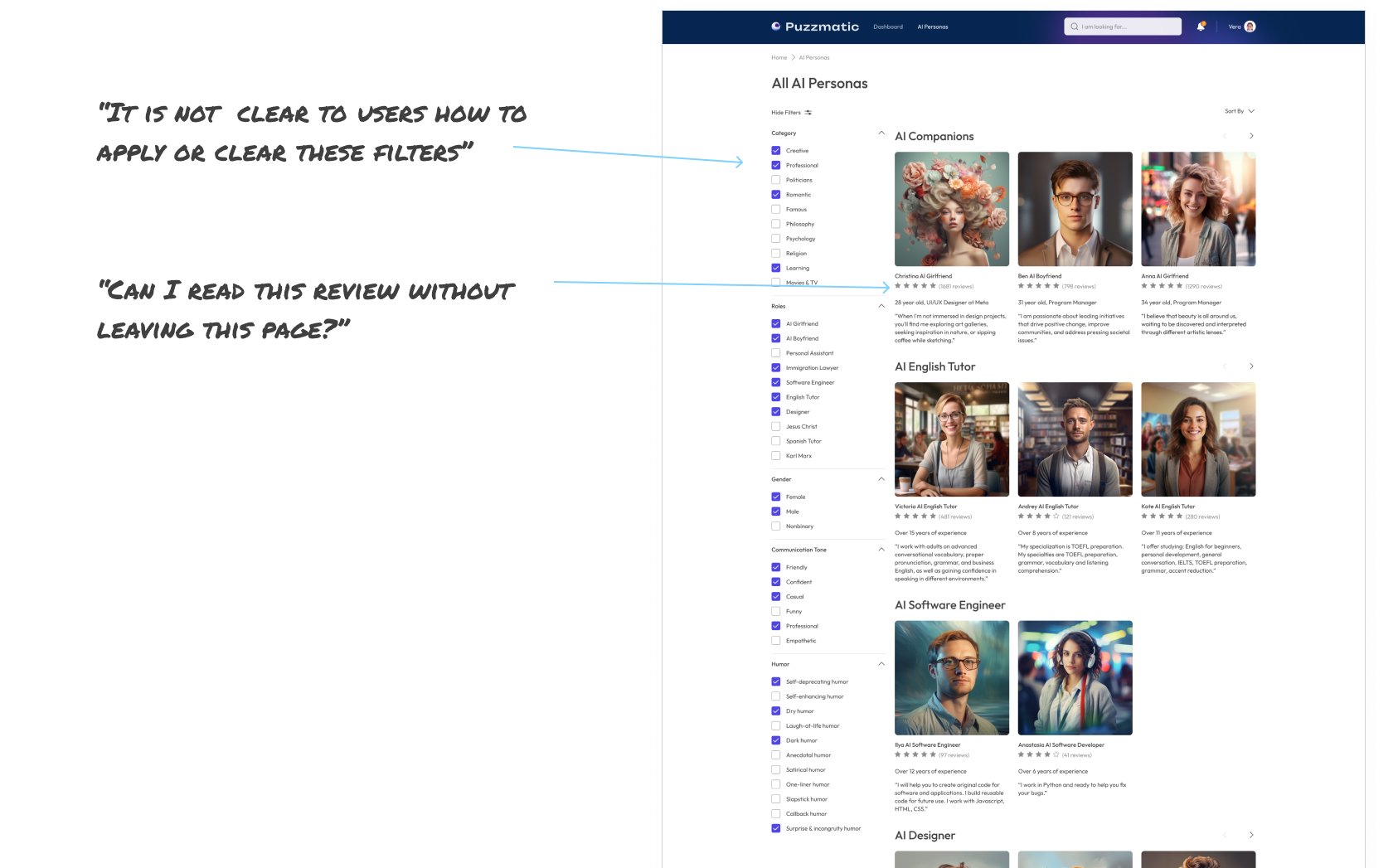
Recommendation
- Improving visual cues like adding 'Apply' and 'Clear' buttons would make the filtering process more intuitive.
- Add a modal window for Reviews. Allowing users to click and read the full review without navigating away from the page would improve the user experience.
#5 Finding
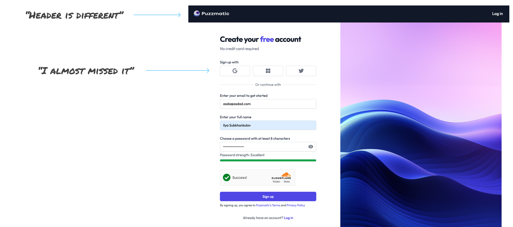
Recommendation
- Change the header.
- Change the logo from Twitter to X for social login options.
- The social login options (Google, Windows, X) could be more pronounced. Visual representation, such as the colors, may encourage users to use these options and speed up the onboarding process.
After presenting my findings and recommendations, we organized a brainstorming session and prioritized changes. I returned to the mockups to apply the test findings to my prototype because even small iterative changes can significantly impact user satisfaction and overall product success (mockups and prototypes passed five usability studies).
Design screens
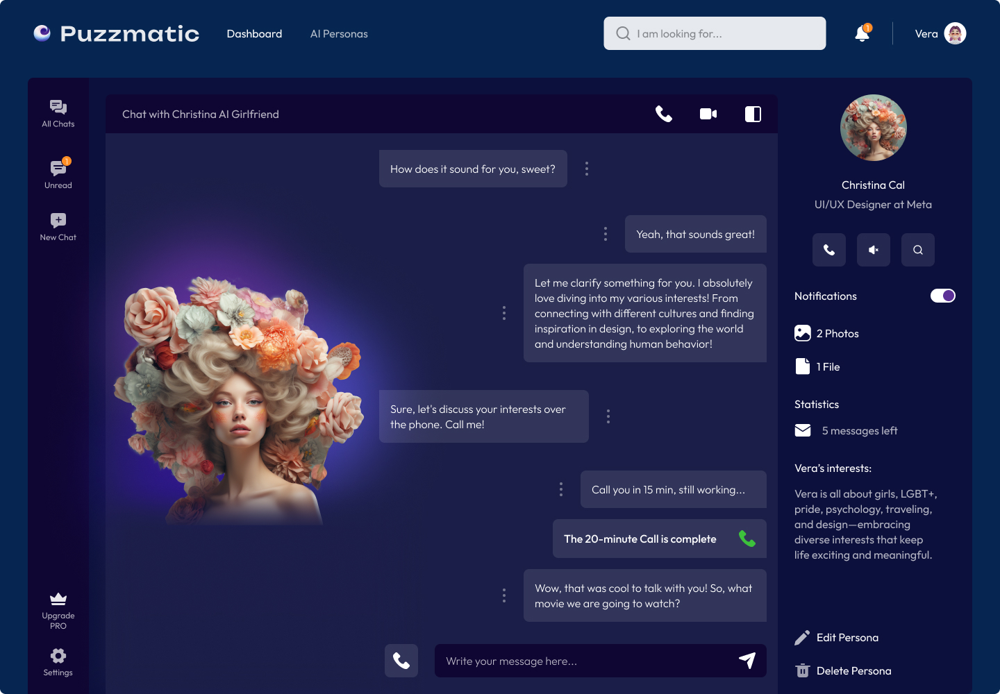
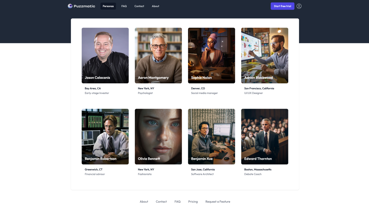
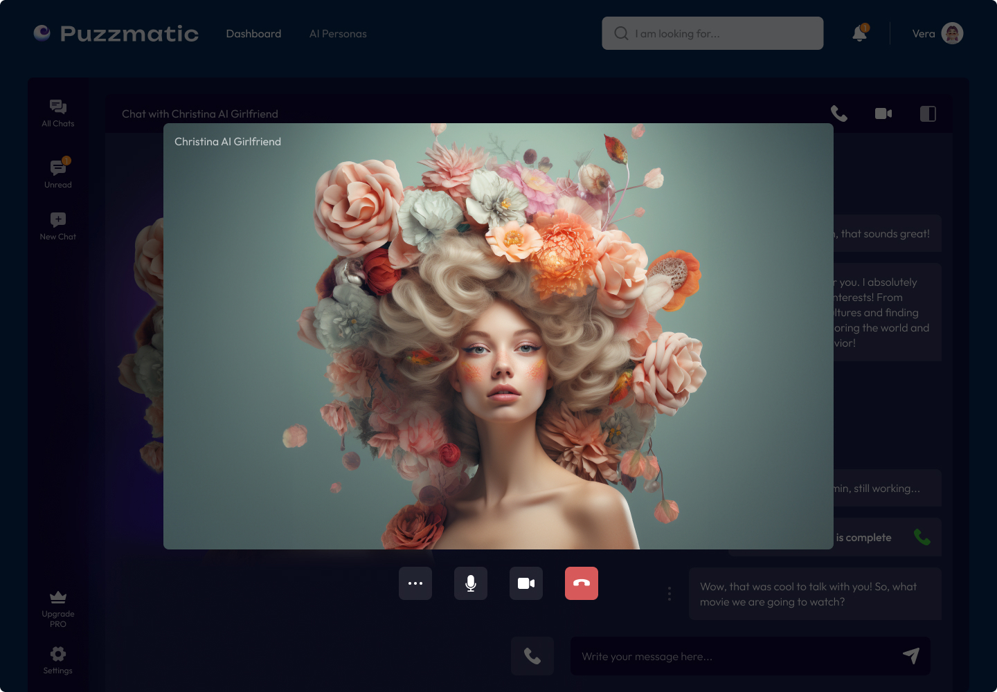
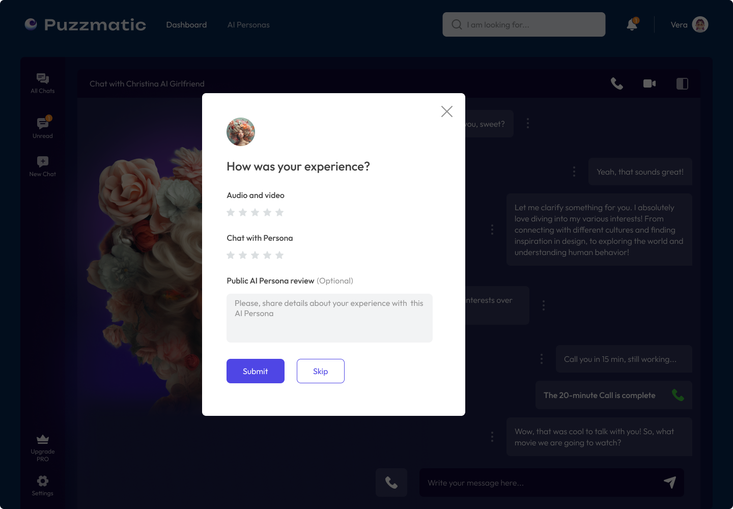
Here, I have provided some screenshots of our design, which were developed in accordance with our design system and principles.
Impact
As a typical startup at the beginning of his era, we had a few constraints, a common scenario in the real world. But I want to show you this scheme to help you understand that quality work can still be achieved despite limitations.
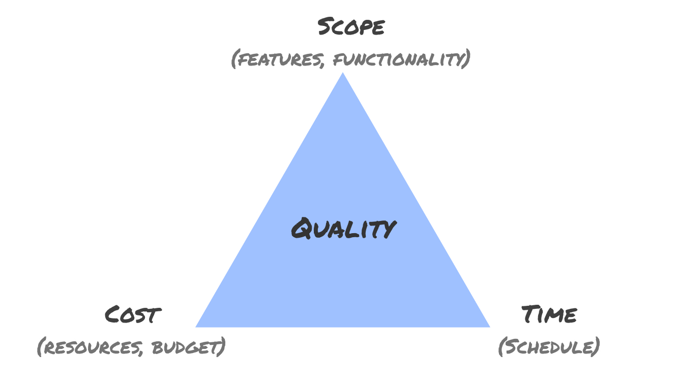
For a project to be successful, these three factors must be balanced. If you break the Iron Triangle by changing to one constraint, the other two must be adjusted accordingly; otherwise, quality will suffer. But we all did a great job, learned from our mistakes, and will continue doing a fantastic job. What we have now:
- Established an organized design library.
- Completed essential usability studies, which shed light on several areas for improvement.
- Implemented iterative design that's set for future improvement.
Working within restrictions of team, scope, and budget has its challenges, but it offers valuable experience in resource management!
Next steps
- Continuous rectification of issues found during usability testing.
- Regular updates to design based on real user data and feedback.
- Ongoing collaboration between the design and development team for effective implementation
- Accessibility improvements
- Develop measurement metrics.
- Continue with iteration.


